PERT Chart
What Is a PERT Chart?
A PERT chart is a visual project management tool used to map out and track the tasks and timelines. The name PERT is an acronym for Project (or Program) Evaluation and Review Technique.
How Is a PERT Chart Different from a Gantt Chart?
PERT charts are similar to Gantt charts in that they offer a graphical view of a project’s tasks, schedule, and timelines. But there are several significant differences between these two types of project management diagrams:
1. Gantt charts are bar graphs; PERT charts are free-form
Gantt charts are drawn as bar graphs along a timeline, as shown below. They represent the tasks and phases of a project with horizontal bars, each drawn to a length representing its estimated timeframe.A PERT chart, by contrast, can be drawn as a free-form diagram. Project managers create PERT charts by drawing boxes or circles (“nodes”) representing events or milestones and connecting them via arrows, representing the tasks that must be completed between each milestone and the amount of time the team will have to complete each task.
2. PERT charts illustrate dependencies; Gantt charts do not
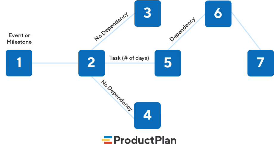
One disadvantage of using a Gantt chart to track a project is that it does not indicate task dependencies. Each bar on the graph stands alone. This makes it difficult for project managers to know how much one missed deadline could affect other chart tasks.PERT charts solve this challenge with the use of directional arrows. These directional (or “concurrent”) arrows indicate that a series of tasks must be completed in sequence because they have interdependencies. On the other hand, diverging arrows indicate functions that can be completed parallel or out of order because they do not have dependencies.In the PERT chart example below, you can see the task represented in node 1 has a dependency because its arrow goes only to node 2. From node 2, however, the team may work on either or both of the tasks represented by the diverging arrows going to nodes 3 and 4. Therefore, these activities do not have dependencies.

What Should a PERT Chart Template Include?
To explain the components of a typical PERT chart, let’s use this mockup of a hypothetical marketing team’s plan to roll out a new campaign.
- Numbered nodes
These are the numbered boxes you see in the PERT chart example above. (Some project managers choose to draw them as circles.)Each node represents an event or milestone in the project, completion of one stage, or a series of tasks needed to move the project forward.
- Directional (or concurrent) arrows
The arrows on a PERT chart represent the tasks or activities that need to be completed before the team can move on to the next event or phase in the project.The task between nodes 1 and 2 (“identify market segment”) is a directional or concurrent arrow in the mockup above. This indicates the task must be completed in the sequence indicated. Project managers use directional arrows to schedule activities that have dependencies.
- Divergent arrows
These arrows represent tasks that a team may work on simultaneously or in any sequence they choose because they do not have dependencies. In the mockup here, you can see an example of this after node 2, for example. The team may work first on the activities leading to node 3 or node 4, or they may choose to complete them simultaneously.
What Are the 4 Steps to Create a PERT Chart?

To create a PERT chart, a project management team should follow these steps.
Step 1: Identify all of the project’s activities.
First, define all of the major phases, milestones, and tasks needed to complete the project.
Step 2: Identify dependencies
If you determine some tasks or activities have dependencies, you will want to depict those tasks with directional arrows. This will ensure your team knows the sequence they need to tackle each task.
Step 3: Draw your chart.
The next step is to take the events and milestones (numbered nodes) you’ve identified and draw them out. Then write out the tasks and activities that the team must complete between each node, using directional arrows or divergent arrows accordingly.
Step 4: Establish timelines for all activities.
You should now set a timeframe when the team will need to complete those tasks along with all arrows. For example, in our mockup above, you can see the “Train sales” activity has a timeframe of 1 day. This can represent the estimated timeframe and/or deadline you set for the activity.
Related Terms
Gantt chart / project roadmap / timeline roadmap / Kanban board / agile product owner
Learn More Ways to Create Strategic Documents for Your Team
Download our Roadmap Template Guide
Your next roadmap starts here.

.svg)


.svg)