Let’s talk product roadmap nuts and bolts.
It can be easy, especially for product roadmap proponents like us, to talk about roadmaps in an abstract sense—discussing how important they are to a product’s success, how useful they can be for bringing cross-functional teams together around a shared strategic goal, and how a product manager should decide which items earn a place on the roadmap.
But in discussing these high-level benefits and strategies of a product roadmap, it’s easy to forget that not everyone knows exactly what an effective roadmap is supposed to look like: what elements it contains, how those elements are displayed, and how to read the roadmap and understand what it’s telling you.
Here at the ProductPlan blog, we’re often guilty of this ourselves.
We’ve offered strategies for choosing the right features for your product roadmap.
Read the Product Roadmaps Guide ➜
Some of our posts walk you through how to conduct an effective cost-benefit feature analysis to determine how to prioritize features on your product roadmap.
And we’ve shared a lot of advice about how best to present your product roadmap—whether specifically to stakeholders, or in a roadmap presentation to teams across your organization.
But what we should also be doing—what we’re going to do with this post—is walk you through a detailed view of an actual product roadmap, including each of its main elements.
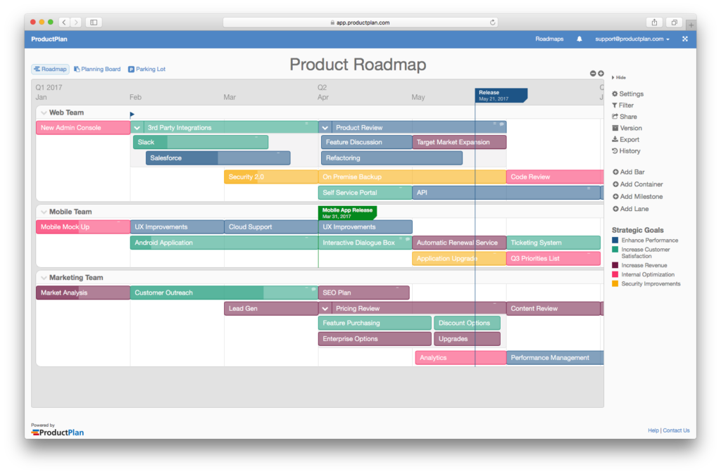
We will be using the roadmap below as our guide.
Note: For illustration and simplicity purposes, we will discuss a roadmap for a single product. Keep in mind, though, that with ProductPlan you can apply all of the elements we’ll discuss below into a roadmap covering multiple products. (Here’s an example of what a multiple-product roadmap might look like.)
The Main Elements of a Product Roadmap
Let’s assume you’ve decided on at least some of your main initiatives and priorities for a new product. You haven’t yet determined each of the features or stories you’ll want for the product’s first version, but you have established a rough, high-level plan for its major strategic objectives.
Now what? How do you start translating those big-picture details into a roadmap? Everyone’s roadmap is going to look somewhat different, but here is a basic framework you can use as a helpful starting point.

Lanes (or “Swimlanes”)
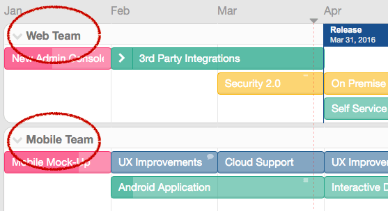
Lanes, sometimes referred to as swimlanes, are a useful way to divide the high-level categories of your roadmap’s initiatives to clearly show divisions of responsibility.
Swimlanes can represent different teams, areas of responsibilities, geographic regions, or whatever categories make the most sense for your company or your product’s division of work.
In the example here, the swimlanes divide product initiatives according to the teams responsible for them, such as the web team and the mobile team.
Containers (or Themes)
Containers will represent the highest level groupings of your roadmap’s initiatives. You can think of containers as the major themes of your plan, the high-level categories to which all of the roadmap’s other items roll up.
Use containers to represent your different epics, projects, themes, or any other items that you are planning. You can see here that containers are used to group strategic initiatives that themselves contain other high-level initiatives—represented by “bars,” which we will examine next.

Bars
Bars are high-level items grouped together under the appropriate containers. These items could represent anything for your product, but you can think of them as the initiatives that all roll up to a given roadmap theme.
In this example, when you expand the “3rd Party Integrations” container you can see that the product manager has included bars representing initiatives to integrate the product with Slack and with Salesforce.

Timelines and Dates
For various reasons, it is sometimes advisable for your roadmap to exclude specific dates, or to display deadlines only for specific initiatives.
As you can see from the example screenshots we’ve shown so far, our sample roadmap contains only high-level references to timeframes—grouping initiatives under months and quarters, as opposed to concrete dates.
The question of when to include timelines on your roadmap, and how granular those timelines should be, will depend on such factors as the roadmap’s audience. When sharing a roadmap publicly, for example, you might not want to display hard deadlines and dates, because if you can’t meet them you risk losing credibility with your customers.
Another factor to consider will be whether a specific product release is tied to a larger, date-driven event. If you want a product to be launched during the week of a major trade show for your industry, for example, then including and even emphasizing specific dates on your roadmap might make strategic sense.
But in some cases, if your roadmap will be accessible to internal audiences only, and if the product’s release is not tied to some other strategic date, it might be smart to de-emphasize dates on your roadmap and focus instead on other strategic aspects of the initiative.
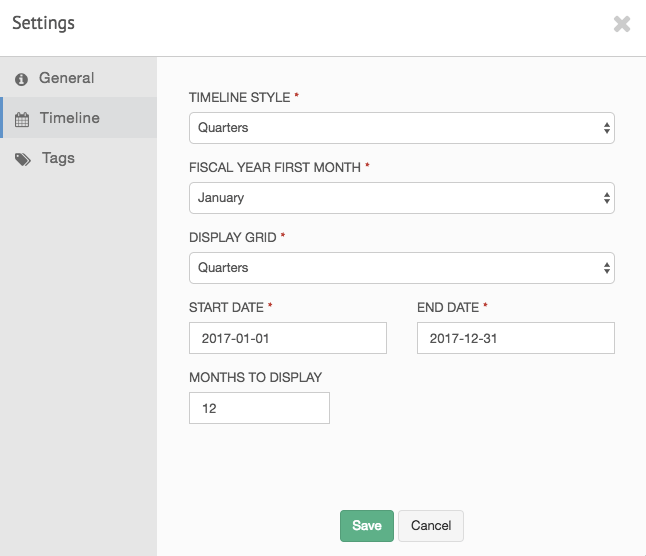
Note: The ability to easily set, alter, and even hide timelines and dates on your roadmap is a powerful reason to use dedicated roadmap software to build and share your product roadmaps—and to avoid making due with tools unsuited to the task, like spreadsheet or presentation tools.
Legends
Determining which legends to display is an important part of turning your roadmap into a powerful communication tool.
You want your audiences—stakeholders, developers, other members of your cross-functional teams, etc.—to be able to quickly view and understand many things about your roadmap. They should be able to see, for example, which items you’ve prioritized and why, your strategic goals behind each initiative on the roadmap, and possibly the progress of each initiative.
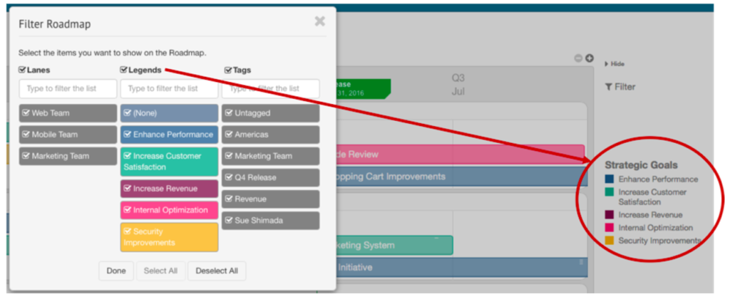
As you can see from the example here, this legend gives the reader an immediate and visually compelling view of what the product owner is hoping to achieve with every initiative on the roadmap. Some items have been prioritized for their ability to increase revenue, others to boost the product’s performance, etc.
And although in our sample roadmap we are displaying only a single legend—Strategic Goals—you might want to further track and depict the strategic details on your roadmap with other legends. Here are a few other examples.

Percent Complete
A well-developed product roadmap should also, ideally, contain up-to-date and immediately accessible information about the status of any initiative, task, or plan on the roadmap.
A reader should be able to click into any item and get a current picture of that item’s progress. Is it complete? Has the team started work on it yet? If it’s underway, what percentage of the task has been completed?
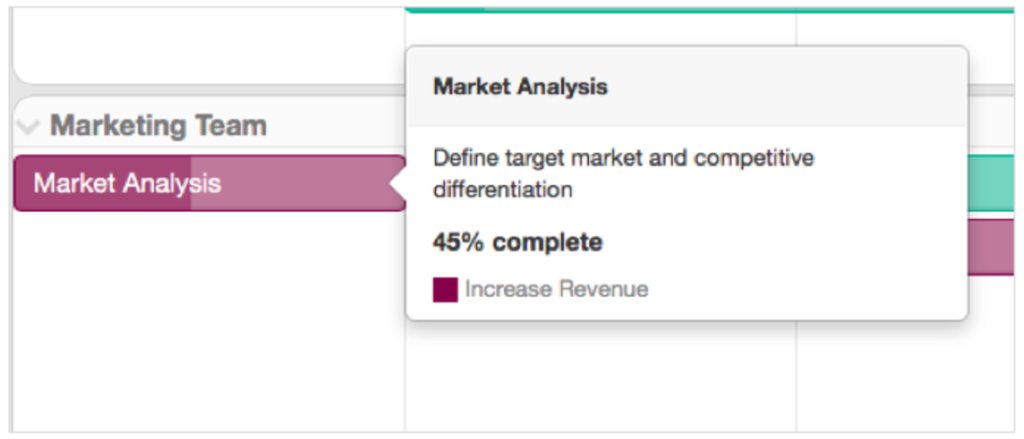
In the sample screen below, you can see that by clicking into the “Market Analysis” bar under the Marketing Team’s swimlane, the reader receives a detailed view of that bar’s current completion level—which in this case is 45%.
Tags
Another useful detail to include on your roadmap, assuming you are using a proper roadmap solution, will be tags.
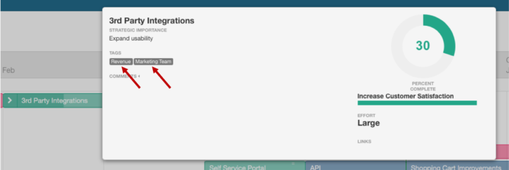
Tags will help you, as the product manager, as well as your cross-functional teams who need to refer back to the roadmap throughout the development process, to more easily track initiatives, goals, and areas of responsibilities.
If you wanted to quickly review all roadmap items that were deemed as helping to increase revenue, then you could filter your roadmap by “revenue”.
The Anatomy of a Product Roadmap
There you have it: Swimlanes, containers, bars, timelines and dates, legends, prercent complete, and tags. Your product roadmaps will vary to some degree, of course, but this should be a helpful starting point, a good list of items to keep in mind when hammering out your next product roadmap.
If you’d like more detail on getting started, please read our page on product roadmap best practices .

