Why a Visual Product Roadmap Makes a Difference

You’ve planned your product strategy, and now you're ready to present your proposed roadmap to the team.You begin to review your spreadsheet outlining how your roadmap will be a needle-mover for the company. Surely everyone can look past the rows of text in 8-point font and see the genius of your strategy, right?Maybe.We have all heard how people respond better to visual information rather than plain text. Yet so many roadmaps are mired in spreadsheets and text-packed presentations.One thing is or certain: a visual product roadmap makes a big difference.
The Value of a Visual Product Roadmap
As product managers one of your key jobs is to be an evangelist for the product. A high-level, visual presentation is a powerful way to help get buy-in on your strategy.In fact, some product teams care so much about creating the right impression that they spend hours crafting a beautiful product roadmap presentation. We regularly hear stories about how much the presentation matters, for example:
- The VP of Product who told us that they had a designer use Adobe Illustrator to create their product roadmap document (unfortunately, the designer needed to be involved in every change).
- The product team who asked the marketing department to create their roadmap document - the document was so beautiful they continued to use it even after the roadmap was outdated!
- The product owner who spent hours each month re-formatting and color-coding an Excel spreadsheet to convey how the roadmap tied to the strategy.
These teams understood the value of roadmap visualization - in fact so much, that they spent an inordinate amount of time and resources getting the presentation right.But in today’s agile world, there isn’t time to hassle with updating a graphic, PowerPoint deck, or spreadsheet every time the roadmap is re-prioritized or your executives want to review it.
Tips for Creating a Visual Product Roadmap
Whether you use PowerPoint, a visual roadmap template, or product roadmap software, here are a few suggestions for creating a roadmap document with impact.
Use Color
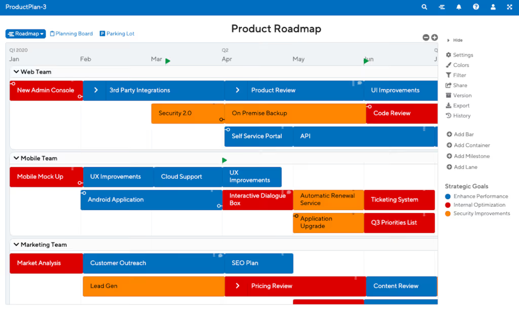
Color is a great way to represent how your roadmap ties to the product vision or strategic objectives. Color code each item on your roadmap to help people make the connection between each initiative and how it fits into the big picture.
Use Large Fonts
People have a limited amount of time to digest your strategy, so use large fonts, especially if you are presenting your roadmap on a projector or in an online meeting. Think of your roadmap very much like a presentation and you'll be ahead of the game.
Keep It High Level
Remember that you are telling a story about how your strategy fits with the product vision. Therefore tell the story in big bold strokes rather than diving into the details. If you can, create logical groupings of initiatives to make the roadmap easier to grasp.
Visual Roadmap Template
At ProductPlan, we've created purpose-built software for product teams to quickly build, share, change, and present a visual product roadmap. To make it even easier, we created a repository of 20+ roadmap templates that can be imported and edited directly in our app. Below is a great visual roadmap template to help get you started.

With ProductPlan, product managers save significant time, because they don't need to head back to their desk to make the changes and re-distribute the roadmap (or worse, send the presentation off to a designer). Some teams are publishing their interactive ProductPlan roadmap to the entire organization by embedding it into their company wiki.We've heard repeatedly from our customers that their stakeholders respond better to a visual product roadmap, helping the product manager achieve buy-in on their product strategy. And with the help of a visual roadmap template like the one above, why not get started today?
Ready to build with confidence?

.svg)


.svg)